The Top 10 Worst Metal Album Covers
January 18, 2024, 3 months ago

You can’t judge an album by its cover.
With some albums, this long-enduring saying is easier said than done. For the many iconic album covers that have spawned inspired artwork, tattoos, and memorabilia, there are countless more that have caused listeners to wince, shield their eyes, or turn away from the music altogether. Some are simply in flagrant disregard of basic design principles, while others feature stomach-churning displays meant to shock the conscience. From small basement-born bands to international staples, no amount of fame can insulate a band from bad album artwork (as bands such as Iron Maiden, Pantera, and Riot can prove). While there are countless albums that may come to mind with a prompt as broad as “worst metal album artwork,” there are few that have experienced such particularly severe opprobrium as those enumerated below.
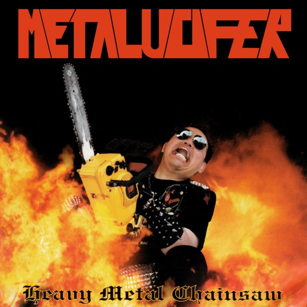
Honorable Mention: METALUCIFER - Heavy Metal Chainsaw
An album that would have otherwise been forgotten to time has instead been preserved in the annals of heavy metal history. Metalucifer’s ironic-iconic “Heavy Metal Chainsaw” gives potential listeners a glimpse of what awaits them within: orange-saturated flames, leather-studded clothes, and the frenetic elation of chainsaw-fueled fury. It has all the authentic flavor of a 90’s DIY project, all of the passion, and all of the laughs for decades to come. While popular appeal may have granted it cult status rather than outright condemnation, it still deserves an honorable mention among other album covers of similar artistic caliber.

10. GRIFFIN - Protectors Of The Lair
There’s subtext, and then there’s whatever Griffin was trying to accomplish on the cover of “Protectors of the Lair.” Two highlighter-green smudges amidst a darkened crevice are the only signs that there was any creative inspiration behind this album art, and to say so much is generous. The magenta-lime tie-dye coloration of the band’s name is a choice just as perplexing, particularly given how well it blends against the rock and grass backdrop. Perhaps it’s best left to the viewer’s imagination as to what beast lies within the titular lair.

9. RAVEN - The Pack is Back
“The Pack is Back” offers up more questions than answers upon its cover. How could the centerpiece member possibly have fit his hair beneath such a snug helmet? How did this trio shatter those steel lockers in such an inexplicable way? Has this “pack” been permanently banned from sporting-goods stores? There’s little more to do than chuckle as more details come into focus. This good-natured fun has opened up “The Pack is Back” to endless ridicule, but given their immortalized expressions that err towards easygoing, it’s hard to believe they’d mind too much.

8. THERION - Theli
The infamous “90’s CGI chic” has earned numerous bands a spot on lists such as this, and Therion is no exception. Supposed to depict the Egyptian god Set, “Theli” instead shows off cutting-edge PS1 graphic design capabilities. The centerpiece is a granular and masculine chest, topped off with a vaguely beast-like head. As though the muddled browns of the color scheme weren’t overwhelming enough, the band determined that faux-stone texture would best suit their logo, and “Theli” is finally polished off with a striking cluster of magenta lines to frame the album’s name. It’s both too much, and too little. Thus “Theli” has found itself memorialized as one of the worst album covers to come from the genre.
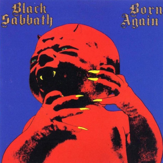
7. BLACK SABBATH - Born Again
Not only was this artwork instantly loathed by the masses, it has also been loathed by the band themselves. Numerous Black Sabbath members have expressed their explicit distaste for the image that presents “Born Again” to the world. Sharp contrast between red and black, a distinct silhouette, and golden claws that emerge from an infant’s fist. It’s nothing less than jarring, if not outright disturbing, to the point that some band members have called it “nauseating.” This alone is enough to lodge it firmly in the top-ten list of metal’s worst album covers.

6. TED NUGENT - Scream Dream
Any rational man would scream if he woke and found his forearms had been hastily blended into the necks of two guitars. That seems to be the case with the artwork adorning “Scream Dream,” an album that is otherwise renowned for the punishing heaviness within its fold - and although it’s more comfortably defined within the realm of hard rock than heavy metal, “Scream Dream” is all but a paragon of heavy music’s artistic hubris. The imagery upon its face leaves much to be desired. Even if there is symbolism to be found within the hands-become-guitars, there may be less justification for the tattered loincloth that (just barely) shields the viewer from outright nudity. Ted Nugent has crafted a legacy, but “Scream Dream” has caused many sharp intakes of breath from unsuspecting - and possibly horrified - first-time viewers.

5. IRON MAIDEN - Dance of Death
Any list of questionable album art would be remiss without taking note of Iron Maiden’s “Dance of Death.” For an album released in 2003, the band had already amassed the following (and the funds) worthy of jaw-dropping album art. And as these terrifying, angular, and soulless CGI figures stared coldly at the viewer upon release, jaws certainly dropped. Without the already-famous Eddie anywhere to be found, Iron Maiden was all but unrecognizable in this overcrowded and uncanny attempt at cover art. Famously, original artist David Patchett requested his name be removed from credits for the art, and clarified that the band decided to use an unfinished draft for the final cover. This background information does little to retract from the actual reality “Dance of Death” presents: an uncomfortable, unfinished, and uncanny attempt at comprehensive CGI. If nothing else, it’s proof that this material spawned near the turn of the century, and was a valuable learning experience for a band whose art never flopped quite so hard again.

4. RIOT - Narita
Maybe someone finds the seal-man mascot from Riot’s early days to be charming. For the most part, however, it is an unsightly beast that strikes unease into the heart of the viewer. The engineering on the plane that absorbs the backdrop of this cover art is just as questionable, with its (presumably) four jet-engines and T-Tail design, and a nose that billows well beyond the aerodynamic capabilities of planes existing at the album’s creation. If the grotesque seal-man and physically-impossible plane weren’t enough, there is also the field of human skulls that scatter the foreground beneath the seal-man’s feet. There are countless objects of fascination on the face of “Narita,” and none of them are particularly complimentary.
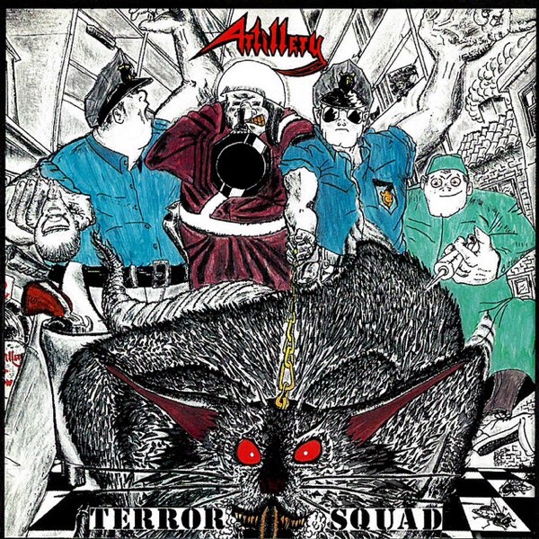
3. ARTILLERY - Terror Squad
Its rapidly-penned appearance, diffuse color, and chaotic subject matter made Artillery’s “Terror Squad” subject to instant criticism. There are numerous possible focal points, from the grotesque rat at the center, to the warped barrel of an enlarged gun, to the finger of a cop staring menacingly at anyone who dares to meet their gaze. The band’s logo, saturated in blood-red and complete with a scythe, seems little more than an afterthought. A thousand questions come to mind upon gazing at “Terror Squad” in all of its glory. Is this piece of art incomplete? Is there a deeper message that has never been uncovered? Was there simply nothing better available? Regardless of these questions, “Terror Squad” has become recognizable for both its music and for its notoriously terrible art, and has thus survived well into the twenty-first century.

2. WOLF - Wolf
At a glance, “Wolf” might be a passable rendition of a beastly canine. But as the viewer gazes longer upon this cool-tone cover art, the more they notice disturbing variances from the expected. Maybe it’s the humanoid eyes that catch the attention first, the way they pierce into the very soul. Perhaps it’s the vultures that replace claws, their features glassy, expressionless. There’s also the terror-stricken expression on the cover’s subject, one akin to what the viewer might experience upon gazing at this creation. Such a nightmarish beast is certain to haunt nightmares for decades to come.
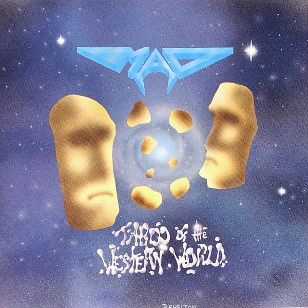
1. M.A.D. - Taboo of the Western World
This is an exquisite piece of art that leaves more questions than it answers. To gaze upon the vaguely humanoid faces upon the cover of “Taboo of the Western World” is to be invited into a world of skepticism, if not concern. Are these Moai-inspired beige figures supposed to be potato chips? Parsnips? Figments of a drug-addled imagination? Some other root vegetable subject to anthropomorphizing? Drastically different fonts, low color contrast, and a cosmic background leave more questions than answers. But of the many album covers that have seen the light of day, “Taboo of the Western World” is one of the few guaranteed to furrow brows or draw laughter upon a very first glance. For this, M.A.D. has earned the top-spot on this list.