Artist IOANNIS Discusses Classic URIAH HEEP, DREAM THEATER, FATES WARNING, SEPULTURA, DEEP PURPLE Artwork - “Machine Head Was One Of The First Albums I Ever Bought"
March 14, 2021, 3 years ago
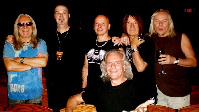
As previously mentioned/discussed in February’s Between A Rock And A Hard Place column, one of the top modern day album cover artists for prog metal – as well as good old fashioned metal and classic rock – has to be Ioannis.
Having worked with the likes of Fates Warning, Dream Theater, Deep Purple, Uriah Heep, Quiet Riot, Sepultura, Allman Brothers, and Lynyrd Skynyrd, his legendary art has reached through a wide variety of metal sub-genres. And here, he talked with BraveWords correspondent Greg Prato how he got started, his inspiration, and the stories behind some of his best-known album covers.
BraveWords: Who are your chief artistic influences?
Ioannis: “Starting when I was 9 or 10 years old in Greece, I collected comic books with Spanish and French illustrators like Moebius and Druillet and Gonzalo Mayo. Also I loved the art in Disney animated features from the ‘30s and the ‘40s. After moving to America I was fascinated by Saturday morning cartoons, especially Jonny Quest, and American comic books illustrated by Barry Windsor Smith, Neil Adams, John Buscema and Jack Kirby. As far as fine art, I was a huge fan of Salvador Dali and Maxfield Parrish. In the early ‘70s - as a young teenager - it was Frank Frazetta, Michael Whelan, H. R. Giger and Japanese animation and artists like Sorayama. Back then, I pretty much wanted to pursue a career as a comic book artist. As a matter of fact, I had done a couple of comic book covers in the early ‘80s. By the time I was 15 or 16, I had become a massive rock music fan. The big turning point was when I walked into my favorite record store in 1975, and my good friend Bob showed me a book that had just come in by record cover artist Roger Dean (Yes and Asia). I remember I didn't put that book down for weeks, and after that, I knew that that was what I wanted to do for the rest of my life. Later on, I discovered the work of Hipgnosis and particularly Storm Thorgerson, which was a huge influence on my art direction and design work.”
BraveWords: How did you start doing artwork for rock bands?
Ioannis: “While going to school and working at my family's restaurant I did a poster for a local rock club. I was 17 at the time, and within a year I was designing for all the clubs in the area, which led me to working for all the FM stations in the area. That led to assignments for promotional posters and then eventually album covers for bands. My first professional cover for a national band was Art In America which was managed by Aerosmith’s lawyer and produced by Eddie Offord (Yes) in 1983. Other commissions soon followed. In 1984, I got a job working at the management company of Lieber and Krebs who managed acts like Aerosmith, AC/DC, Scorpions, Joan Jett, Michael Schenker, Ted Nugent, Frank Marino, and so many others. It was always a beehive of activity. Paul O’Neil (Savatage, TSO, Badlands) gave me my next project - a metal band named Heaven, and I met this young guy who was starting a record label, named Brian Slagel. And that was Metal Blade.”
BraveWords: It seems like you’ve done the most album covers for prog metal bands. Is that your favorite rock style?
Ioannis: “I can see why you would ask. It's because early on I was an illustrator and the type of art I did was fantasy art, which worked very well for metal and prog bands. However, by the mid ‘80s I started art directing and designing covers for a variety of artists. In the last 30 years I have worked on jam bands, jazz fusion, electronic music, southern rock, blues, and classic rock. Rap music is probably the only genre I have not done. I've also done film posters, entertainment company logos, DVD's and tour merchandising, including Broadway shows.”
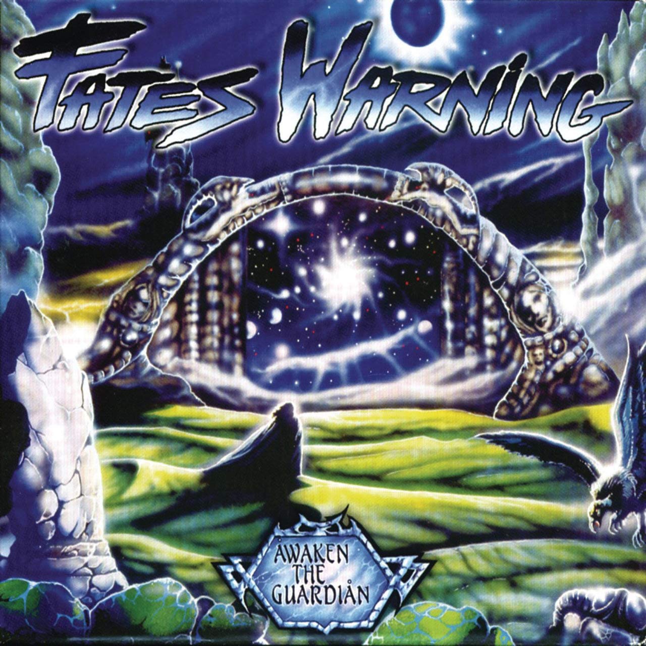
BraveWords: Let’s discuss some of your album cover artwork, starting with Fates Warning - Awaken the Guardian
Ioannis: “This was my second cover for the band, after The Spectre Within in 1985, and it was a continuation of a loose storyline that I created of the character that appeared on that cover. At the time, it was the hardest project I had ever worked on for two reasons. The record label wanted me to top the cover I did for Spectre Within, as did the band, because this was one of the most important albums for them with a new lineup. For me, it was also the first time that I art directed and designed a complete package. I was frustrated in the beginning, there were several versions that I did that just didn't look right. At one point the band even considered working with someone else if I could not finish on time because they were facing very tight deadlines. The art depicts a dark side and light side - representing good and evil. The character leaving the dark world through a portal, emerging in a Zen state. The interesting thing was that I painted the back cover first, then the inside spread, then the cover which was so difficult for me. I also designed a brand new logo for the band. The concepts came from discussions with John Arch, and the lyrical content and of course also the music, specifically the opening track of the album, which is almost a soundtrack to the cover.”
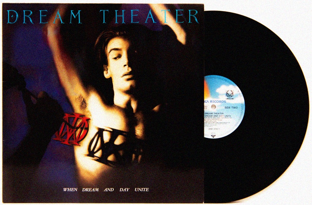
BraveWords: Dream Theater - When Dream And Day Unite.
Ioannis: “In 1989, I was hired as the creative director for Mechanic Records in New York City. The label had just launched and there were a number of new bands they had signed with new releases coming. One of those was Dream Theater. The original name of the band was Majesty. At the last minute they discovered that there was a similar unsigned band in the Midwest, so they decided to change the name of the band. The cover was a collaboration with photographer Amy Guip. By then, as an art director, I was creating cover art that was collaborations with other creative individuals, specifically photographers, like Mick Rock. The band changed their name after the artwork was created with the main character on the cover having the Majesty logo branded on his chest. They were very pleased with the artwork as was the label head and cemented my relationship with the label. I worked on all the label’s releases including Voivod, working on the album Nothingface, along with Away - the band’s drummer, who did these incredible drawings.”
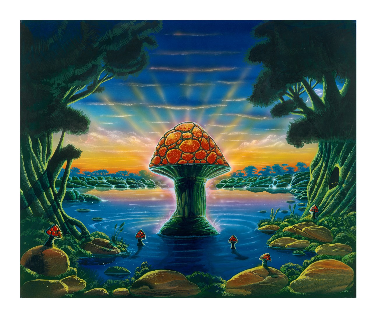
BraveWords: Allman Brothers Band - Where It All Begins.
Ioannis: “In early 1994, I went up to Boston to meet with the Allmans’ manager - to show him artwork for their tour merchandising for that summer’s tour. While I was there, he informed me that they were recording a new album in Jupiter Florida, the tentative title of which was Greetings From Jupiter, and they were in need of an album cover. He suggested I forget about doing the tour merch and focus on doing the cover art. I was given a short brief by Dickey Betts and told to come back in a few days with an idea. I did a miniature illustration to showcase my concept and presented it to the manager and the band, which they loved. When I was given the commission, I was told to deliver the package in a couple of days. When I told them I had to paint the cover they were shocked, as they thought my little comp WAS the cover.
“I assured the manager that the finished painting would be just as good as the comp, and drove it up to their rehearsal studio to show it to them a week later. Their manager brought each member in separately to get their approval. Dickey was the last one in. When he looked at it he said, ‘This to me says ‘Where it all begins.’’ And that was the first time I heard the title of the album. An interesting thing that happened was while each band member was looking at the art, their manager whispered in my ear, ‘This looks fantastic, but nothing at all like the comp you brought me last week.’ Because I had left the comp with him, I did everything from memory and I had pretty much forgotten what it looked like. I finished the rest of the package layout and the merchandise designs and was with them when they performed at Woodstock II that summer. A fine art reproduction of the cover hangs in the Allman Brothers museum, the Big House in Macon Georgia. Along with other examples of my artwork for them - including the poster from the 2007 tour with Bob Weir.”
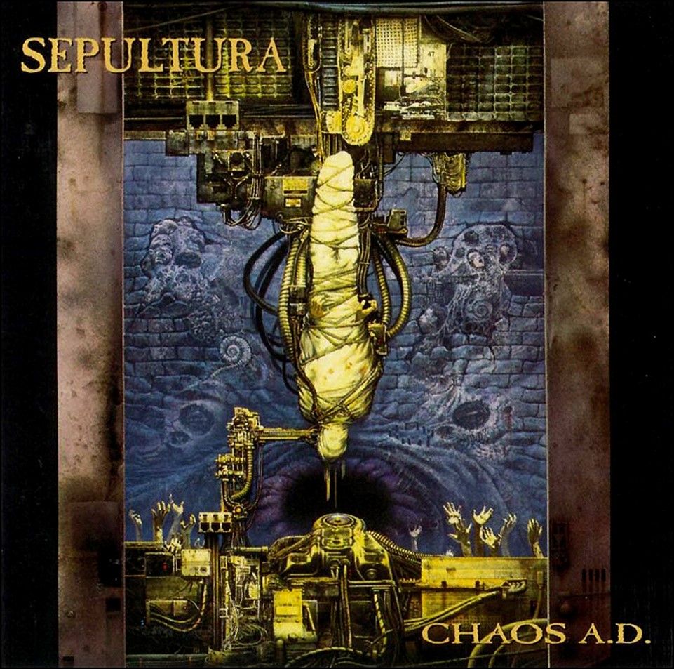
BraveWords: Sepultura - Chaos AD.
Ioannis: “In 1993, Monte Conner from Roadrunner Records, who I knew very well and who liked my work asked me if I'd be interested in art directing his new project for Brazilian metal act, Sepultura. I really liked the band and I agreed, even though he informed me that he already had the cover art done. To my delight, the cover painting was by Michael Whelan, who I was a fan of. So I welcomed the opportunity to work with him. At that time I was working on two to three covers a month for a variety of clients, as I was now running a full-fledged design agency. After I saw the painting I started to create the packaging, which included a logo, symbols, additional images for the booklets and vinyl and even a new band photograph for the package. Everything was done by hand, as this was before Photoshop. There was a lot of pressure to design all the components before the band went on tour. I loved working with Max, the lead singer of the band and coming up with ideas for the package. I attended several of their concerts and remember being happy to see my work displayed onstage and in the merch.”
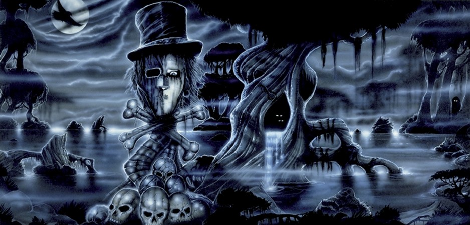
BraveWords: Quiet Riot - Down To The Bone.
Ioannis: “Mark Weiss, a good friend and famous rock photographer told me he was doing a photo shoot for the band and they were looking for a record cover. I went to one of the band’s concerts and met them at their hotel. My meeting was with Frankie Banali and Kevin DuBrow. As we talked about the cover, they told me that they wanted an illustration and were very keen on using something akin to the Spectre Within. I proposed an idea using their mascot (the character from their first album) and went back to the studio, where I sketched out a layout. I Fed Ex’d the comp to them while they were on tour, and over the phone I explained what I was going to do. The actual illustration was painted over a one week period primarily using colored inks. I brought the artwork to their manager for approval and then created the layout package including the logo for their new record label. It was an instant success for the band and the art was very well received. In 2006, a poster company approached me and I did a deal where posters of the artwork were sold in malls around the country and outlets like Spencer’s Gifts, and online. You can still find them today. The original was sold to a private collector. It remains one of my favorite images and metal bands constantly request a similar look. The image is a cross style of H.R. Giger meets Michael Whelan.”
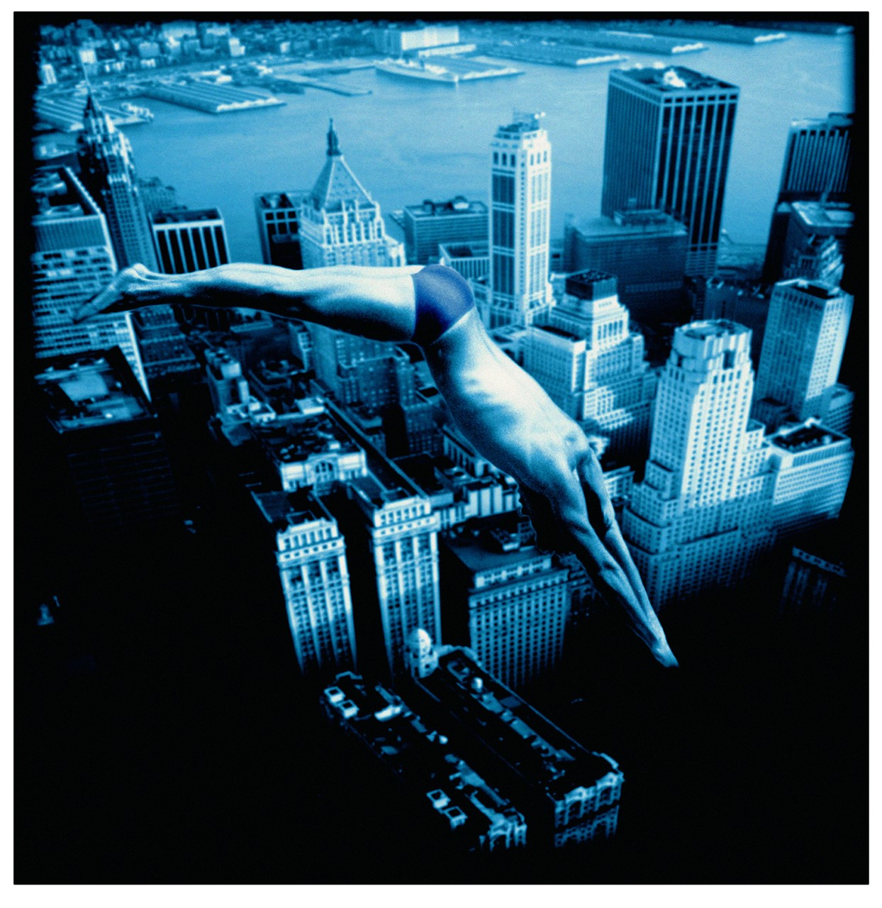
BraveWords: Deep Purple - Abandon.
Ioannis: “In 1997, I had just completed cover artwork for Yngwie Malmsteen. His manager Jim Lewis office was next door to Deep Purple's management. The band had just finished recording their new album and were very upset at the cover design presented by the record company. Jim called me and asked me if I would drive down immediately to meet with Deep Purple's management at Jim’s office. When I arrived I found the manager and Roger Glover waiting for me. We discussed the music and several ideas and Roger described to me that he wanted a feeling of somebody taking a chance - someone with ‘wild abandon.’ One of the things that he mentioned was that he liked the play on words of a/band/on. Although we liked the thought, we quickly decided on something more aggressive. He suggested someone diving into a pool of sharks. I suggested someone diving off a building. A swimmer, a surreal image. They also asked me to come up with a couple more ideas. The cover that I came back with was one of my first digital pieces. A combination of photos that were tinted blue, of a surreal image of someone diving into the skyline of New York, creating a ripple in the air. So you weren't sure if he was diving into the air or a reflection in a pool.
"The band loved the artwork and for the next 6 weeks I designed all the components of the packaging, tour, promotional materials and merchandising. Roger Glover and I became friends. Several months later when the band toured with Dream Theater and Emerson Lake and Palmer, I was invited to attend their concert as a VIP guest. It was during the opening number when the band hit the stage and the crowd roared with applause and I saw a backdrop of my art that I realized the impact of my work for the band. It was a very sentimental moment for me, as Machine Head was one of the first albums I ever bought at the age of 13. Never dreaming that decades later, Deep Purple would be my friends and clients.”
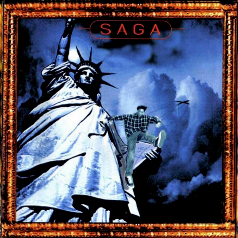
BraveWords: Saga - Generation 13.
Ioannis: “I met Saga's manager at a music convention in Los Angeles in 1995. I was asked if I would be interested in art directing their album cover at that time. They had just started their own record label. Steel Umbrellas was the first cover I did for them and the first time I used Photoshop for digital work. Prior to that everything was collage and airbrush. A year later, they purchased two of my paintings to use for ‘best of’ and live albums. I have since done several covers for Saga, all the way to the year 2000. But the one I'm most proud of, and what I think is one of their best and most progressive albums is Generation 13. The digital piece was done using models and a variety of backgrounds digitally composed. It captures a specific moment in the storyline of the album. I remember long conversations with Jim Crichton the bands bass player, producer and creative source about the themes and lyrics and the best way to visualize them. I was very happy with the result at the time. Unfortunately, the band did not do a tour of America - so I never got to see it performed live.”
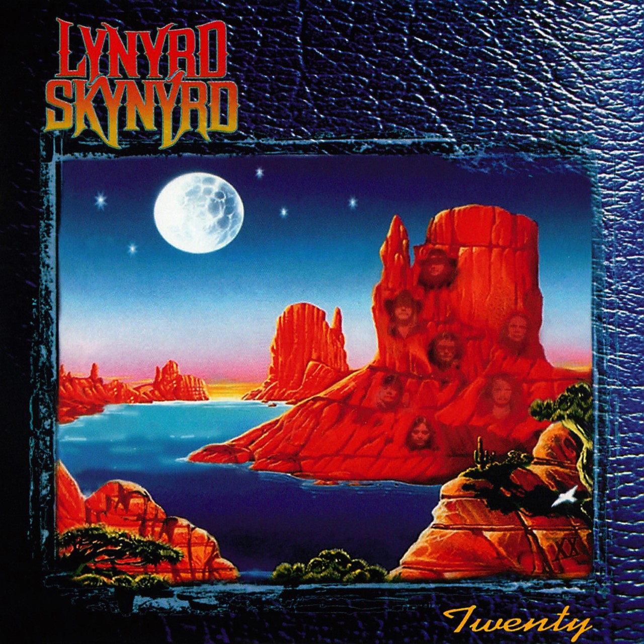
BraveWords: Lynyrd Skynyrd - Twenty.
Ioannis: “In 1997, Lynyrd Skynyrd, who had recently regrouped, was recording a new album for a new record company. I was asked to meet with their manager in NYC and talk about the cover art. I showed my ideas to their manager and to my disappointment, he didn't like any of them. As I was getting ready to leave, he asked ‘Are you sure you don't have anything else I could see?’ I told him that I did have my portfolio of my paintings with me (the ideas I had shown him were mostly photographic). As he flipped through the artwork he landed on the painting that became the cover. What he liked was the black bird flying over the canyon, because it reminded him of ‘Freebird’ and the album they were recording was called XX - to commemorate the 20th anniversary of the plane crash that had killed several members of the band. With a few additions and tweaks, it became their new album cover. They were very happy, had me design merch and several more album covers in the years to come. People who collect my work regularly purchase prints of that painting. The original was sold to a private collector.”
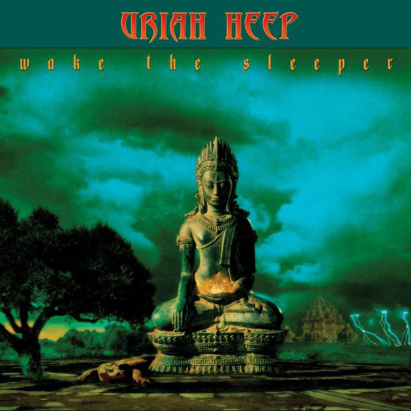
BraveWords: Uriah Heep - Wake The Sleeper.
Ioannis: “In 2005, while doing an interview for the UK magazine, Record Collector, I mentioned in the end that one of the bands that I listened to when I was young in Athens Greece, was Uriah Heep. Mick Box read that interview and was familiar with my work, having been on tour with Deep Purple. He emailed me and told me that the band was recording their first album in 10 years and would I be up for doing the cover. At first I thought it was a friend of mine playing a joke, but after he phoned me I quickly realized that it was actually Mick Box!
“My next conversation was with the band’s manager who told me he was looking for something fresh and different, and he didn't want it to look anything like any of their previous album covers. I thought that was a mistake, as Roger Dean’s artwork had resonated so much with their audience, that abandoning that style was not a good idea. So I decided that when I did the design it bore a resemblance to his design style. The images came from an old book found in a flea market that my wife gave to me as a gift. It was 1940's images of Thailand. An image of a Thai Buddha I thought was appropriate for the title in a surreal Asian landscape, with a Komodo dragon circling the ruins. It was the only concept that I proposed. The band had seen several submissions from a variety of artists and studios. As Mick told me later, the first time they saw the cover was on a laptop on a flight to Moscow - heading to a concert. As Mick recalls, they all circled around his seat and they all unanimously agreed that it was the cover. I designed the packaging, reworked the photos and all the stage graphics, and when the band played America I did a series of appearances with them to sign autographs for the fans along with the band. What really was a great moment for me was when Mick came to greet me at the end of the night, every member of the band came up to me personally to shake my hand and thank me for creating an amazing record cover. That's about as good a compliment as you could ask for.”
BraveWords: Future plans/projects?
Ioannis: “There are a number of things that I’m in the middle of, including new prints, merchandise deals of my work, a number of exhibitions and appearances, two new music projects, a special project with my friend Mick Rock, and a book about the Beatles with my friend Denny Somach, who I have also done a book about Led Zeppelin with. A good way to keep up is to follow me on Facebook, Instagram, Twitter, and YouTuber, check out my new website.”

